데이터 시각화를 하려면 먼저 변수에 적합한 plot 종류를 선택합니다. 그리고 나면, 형식 지정, 라벨 지정 및 제목 지정 단계를 거쳐야 합니다. 이번 포스팅에서는 Python을 사용하여 데이터 시각화 기본 디자인 11가지에 대해서 알아 보겠습니다.
데이터 세트
학습을 위한 데이터 세트는 Kaggle에서 가져온 보험 데이터 세트입니다.
# 실습을 위한 필수 라이브러리 임포트

import numpy as np
import pandas as pd
import matplotlib.pyplot as plt
import seaborn as sns
sns.set_style('darkgrid')

%matplotlib inline

import warnings
warnings.filterwarnings('ignore')
# 데이터 세트 읽어 들이기
insuranceData = pd.read_csv('https://raw.githubusercontent.com/Tiamiyu1/Health-Insurance-Analysis/main/insurance.csv')
# 데이터 세트 행과 열의 수 확인하기
insuranceData.shape
-------------------------------------------------------------------------
(1338, 7)
# 데이터 세트 상위 5개 행 출력하기
insuranceData.head()
-------------------------------------------------------------------------
age sex bmi children smoker region charges
0 19 female 27.900 0 yes southwest 16884.92400
1 18 male 33.770 1 no southeast 1725.55230
2 28 male 33.000 3 no southeast 4449.46200
3 33 male 22.705 0 no northwest 21984.47061
4 32 male 28.880 0 no northwest 3866.85520Plot Titles
플롯 제목은 데이터 시각화에 대한 적합하고 명확한 설명으로 분석자가 의도한 메시지를 효과적으로 전달합니다.
# 한글 깨짐 현상 방지를 위한 폰트 설정
plt.rcParams['font.family'] = 'Malgun Gothic'

sns.histplot(insuranceData.bmi)

# 제목 설정
plt.title('BMI 변수에 대한 히스토그램') 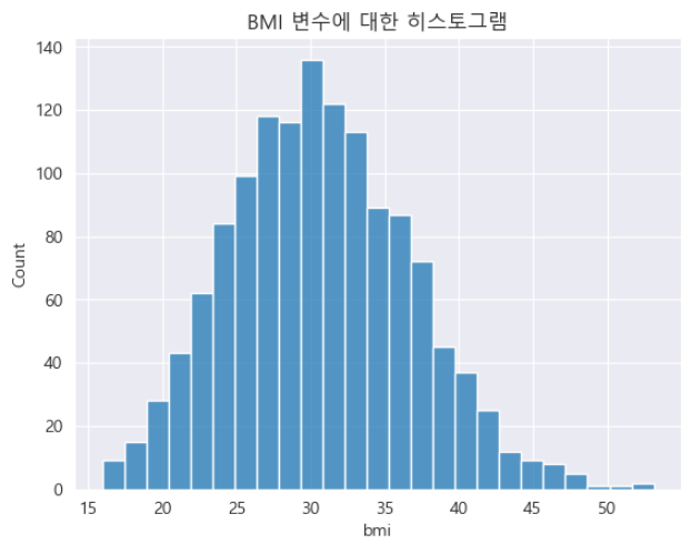
축 라벨 정의
아래의 코드로 y축과 x축에 플롯되는 변수에 대한 정보를 전달하는 의미 있는 라벨을 생성할 수 있습니다.
# 플롯 사이즈 설정
plt.figure(figsize=(20,6))

# 기본 축 라벨을 가지는 플롯
plt.subplot(1,2,1)
sns.scatterplot(x = insuranceData.bmi, y = insuranceData.charges,  hue = insuranceData.smoker)
plt.title('1. Scatter Plot of Charges and BMI vs Smoker')

# 정보를 제공하는 축 라벨을 가지는 플롯
plt.subplot(1,2,2)
sns.scatterplot(x = insuranceData.bmi, y = insuranceData.charges,  hue = insuranceData.smoker)
plt.title('2. Scatter Plot of Charges and BMI vs Smoker')
plt.xlabel('Body Mass Index (BMI)') # X축 라벨
plt.ylabel('보험료') # Y축 라벨 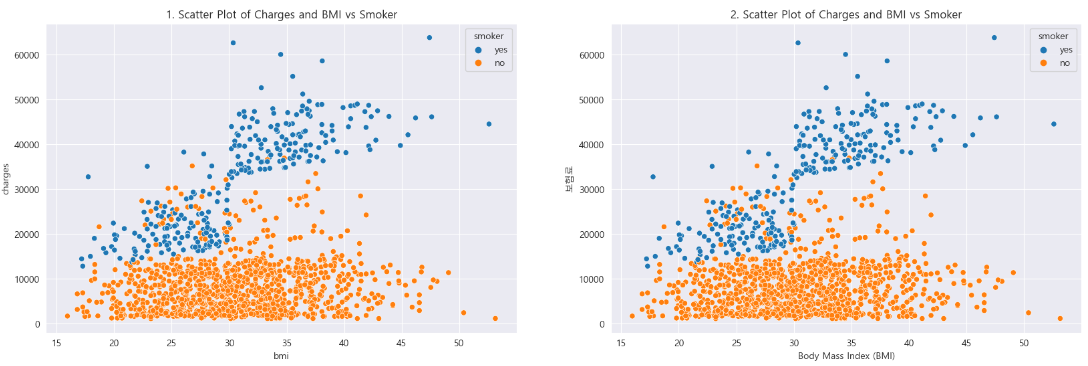
값에 대한 라벨
성별(남성과 여성)에 대해 0, 1과 같이 숫자 값으로 범주형 변수를 나타내는 데이터 세트를 처리할 때는 시각적 표현을 세분화하는 것이 좋습니다.
두 개의 리스트가 있는 plt.xticks() 함수를 사용하면 됩니다.
첫 번째 리스트는 고유 변수 값(예: 0 및 1)으로 구성되고, 두 번째 리스트는 데이터 세트 값을 변경하지 않고.
플롯된 그래프를 명확하게 하기 위해 대체 라벨(예: 남성 및 여성)을 포함합니다.
insuranceDataCopy = insuranceData.copy()
insuranceDataCopy.sex.replace({'female':1, 'male':0}, inplace = True)
위의 코드는 데이터 세트를 복사하고, 성별 값 ‘male’과 ‘female’을 각각 0과 1로 바꾸는 코드입니다.
아래 코드는 0과 1의 숫자 값을 통합하여 수정된 데이터 세트를 시각화하여 플롯된 그래프에 대한 변환의 영향을 보여주었습니다.
plt.figure(figsize = (20,6))

# 기본 축 라벨을 가지는 플롯
plt.subplot(1,2,1)
sns.countplot(x = insuranceDataCopy.sex)
plt.title('기본값 0과 1을 가지는 플롯')
plt.xlabel('성별') # X축 라벨
plt.ylabel('성별 수') # Y축 라벨

# 정보를 제공하는 축 라벨을 가지는 플롯
plt.subplot(1,2,2)
sns.countplot(x = insuranceDataCopy.sex)
plt.title('많은 정보값을 가지는 플롯')
plt.xlabel('성별') # X축 라벨
plt.ylabel('성별 수') # Y축 라벨
plt.xticks([0,1], ['Male', 'Female']) 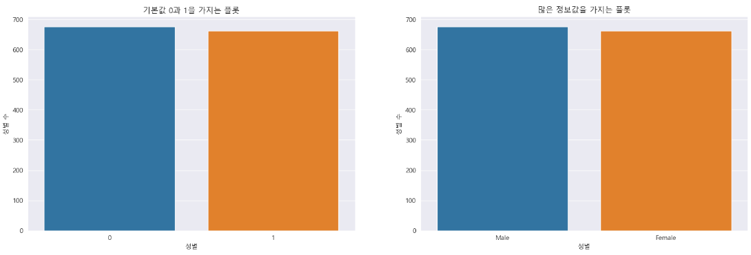
깔끔한 텍스트 출력
가끔 텍스트 출력이 플롯과 함께 표시되어 플롯 창의 상당 부분을 차지할 수 있습니다.
이는 시각화 코드의 마지막 줄에 세미콜론(;)을 추가하거나 plt.show() 함수를 최종 명령문으로 통합하여 더 깔끔하고 간결한 표현을 할 수 있습니다.
sns.countplot(x = insuranceDataCopy.sex)
plt.title('텍스트 출력을 표시하는 성별 수')
plt.xlabel('성별') # X축 라벨
plt.ylabel('성별 수') # Y축 라벨
plt.xticks([0,1], ['Male', 'Female'])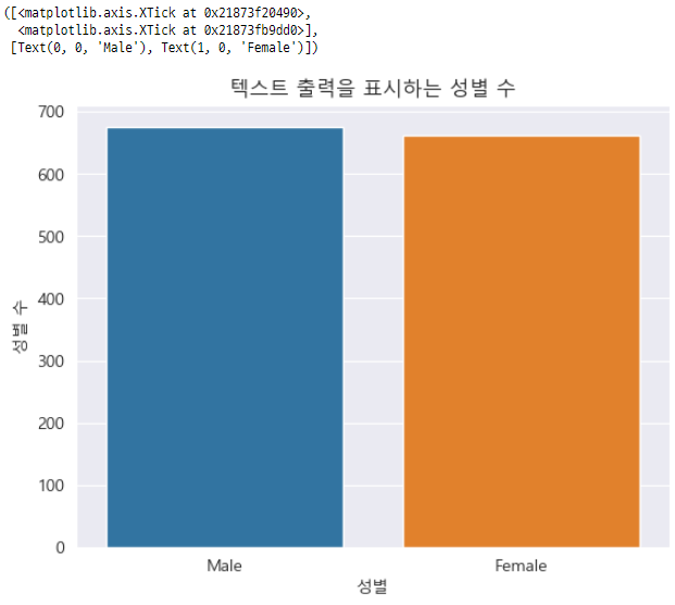
sns.countplot(x = insuranceDataCopy.sex)
plt.title('텍스트 출력을 표시하는 성별 수')
plt.xlabel('성별') # X축 라벨
plt.ylabel('성별 수') # Y축 라벨
plt.xticks([0,1], ['Male', 'Female']);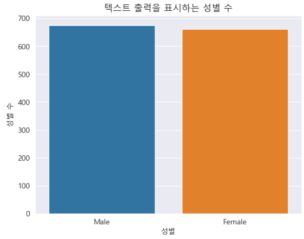
색 구성표
기본 색 구성표는 추가 정보를 효과적으로 전달하지 못할 수 있습니다. 일관성 있고 균일한 색 구성표를 선택하면 플롯의 전반적인 선명도와 효과를 향상시킬 수 있습니다.
import datetime as dt


# 임의의 날짜 변수 생성하기
startDate = pd.to_datetime('2021-01-01')
endDate = pd.to_datetime('2023-12-31')
insuranceData['datetime'] = pd.to_datetime(np.random.uniform(startDate.value, endDate.value, len(insuranceData)))
insuranceData['month'] =  insuranceData.datetime.dt.month_name()
insuranceData['year'] =  insuranceData.datetime.dt.year

plt.figure(figsize = (18,6))
plt.subplot(1,2,1)
sns.countplot(x = insuranceData.month)
plt.title('월 분포: 기본 색 구성표')

plt.subplot(1,2,2)
sns.countplot(x = insuranceData.month, color = sns.color_palette()[0])
plt.title('월 분포: 균일한 색 구성표' );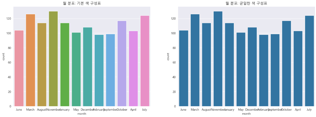
축 회전
위의 차트를 자세히 관찰하면 특정 월에 해당하는 라벨이 겹치는 것을 확인할 수 있습니다. plt.xticks() 함수를 사용하여 라벨을 회전시켜 월 이름을 겹치지 않게 출력하여 가독성을 높입니다. 이 접근 방식은 plt.yticks()를 사용하여 y축에도 동일하게 적용할 수 있습니다.
sns.countplot(x = insuranceData.month, color = sns.color_palette()[0])
plt.title('월 분포: 균일한 색 구성표' )
plt.xticks(rotation = 90);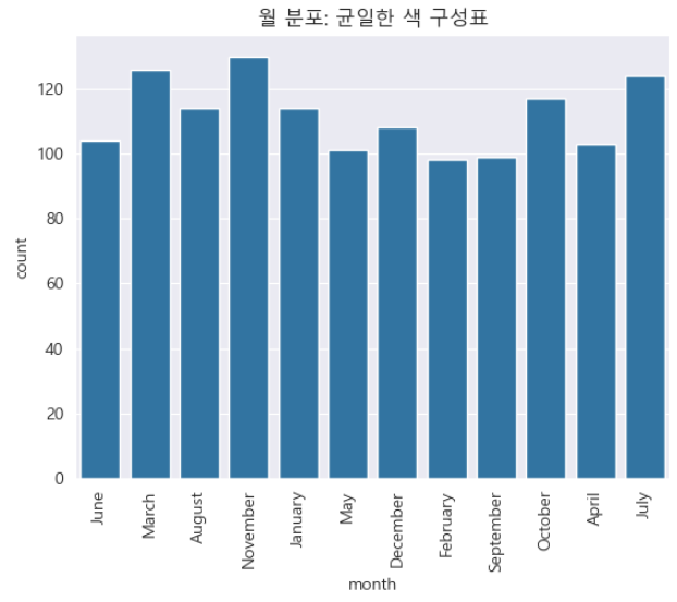
범주형 변수 정렬
위의 count plot에는 월의 순서가 정렬되어 있지 않습니다. 범주형 변수를 처리할 때 두 가지 일반적인 정렬 전략, 즉 자연 순서(예: 1월부터 12월까지)를 고려하거나 감소하는 값 건수를 기준으로 구성할 수 있습니다. 건수 중요도가 가장 중요한 경우 후자를 우선시합니다.
# X축의 범주형 자료의 자연 순서 기준으로 정렬된 플롯

plt.figure(figsize = (20,8))

plt.subplot(1,2,1)
orderDay = ['January','February','March','April','May','June','July','August','September','October', 'November','December']
sns.countplot(x = insuranceData.month, color = sns.color_palette()[0], order = orderDay)
plt.title('자연 순서 기준 정렬 플롯' )
plt.xticks(rotation = 90)


# 개수 기준으로 정렬된 플롯

plt.subplot(1,2,2)
sns.countplot(x = insuranceData.month, color = sns.color_palette()[0], order = insuranceData['month'].value_counts().index)
plt.title('건수 기준 정렬 플롯' )
plt.xticks(rotation = 90);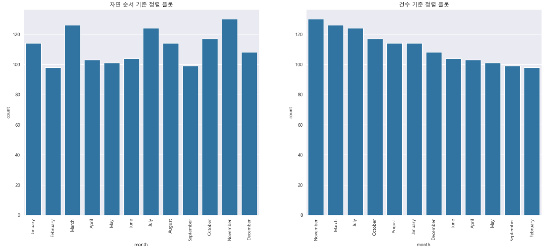
플롯에 값 표시
막대에 정확한 값을 직접 표시할 수 있습니다. 데이터를 더욱 명확하고 해석하기 쉽게 표현할 수 있습니다. 값은 총 개수에 대한 백분율로 표시될 수도 있습니다.
plt.figure(figsize = (18,6))

plt.subplot(1,2,1)
ax = sns.countplot(x = insuranceData.region,  color = sns.color_palette()[0])
plt.title('막대에 값 표시')
for p in ax.patches:
    ax.annotate(f'{int(p.get_height())}', (p.get_x() + (p.get_width() / 2.), p.get_height()), ha='center', va='baseline')


plt.subplot(1,2,2)
ax = sns.countplot(x = insuranceData.region,  color = sns.color_palette()[0])
plt.title('막대에 비율 표시')
total = len(insuranceData)
for p in ax.patches:
    percentage = '{:.1f}%'.format(100 * p.get_height()/total)
    x = p.get_x() + p.get_width()/2
    y = p.get_height()+.05
    ax.annotate(percentage, (x, y),ha = 'center')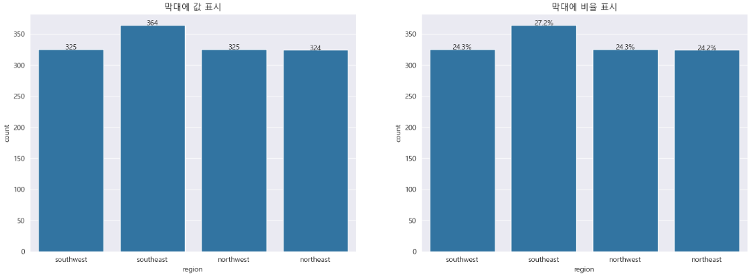
원형 차트 사용자 정의
원형 차트는 값 개수에 따라 파이 조각을 정렬하고, 시작 각도를 지정하고, 시계 방향을 결정하여 향상된 시각적 효과를 나타낼 수 있습니다. 정확성을 위해 슬라이스 백분율 소수점을 정확하게 조정할 수 있습니다. 세련된 원형 차트를 원하시면 wedgeprops 매개변수를 조정하면 됩니다.
sortedCounts = insuranceData['region'].value_counts()

plt.pie(sortedCounts, labels = sortedCounts.index, startangle = 90, counterclock = False, autopct='%.0f%%', wedgeprops = {'width' : 0.6})
plt.title('원형 차트');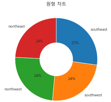
범례 배치
차트 범례가 중요한 정보를 가릴 수 있습니다. 이러한 문제를 해결하려면 범례의 위치를 재배치하거나 필요한 경우 차트 영역에서 완전히 제거하는 것도 고려할 수 있습니다.
plt.figure(figsize = (24,6))

plt.subplot(1,3,1)
sns.countplot(x = insuranceData.region, hue = insuranceData.year)
plt.title('기본 범례 위치')

plt.subplot(1,3,2)
sns.countplot(x = insuranceData.region, hue = insuranceData.year)
plt.title('범례 위치 중앙')
plt.legend(loc = "center") # 기타 'upper left', 'upper right', 'lower left', 'lower right' 지정 가능

plt.subplot(1,3,3)
sns.countplot(x = insuranceData.region, hue = insuranceData.year)
plt.title('범례의 위치를 차트 영역에서 제외')
plt.legend(loc = "best", bbox_to_anchor = (1, 0.5));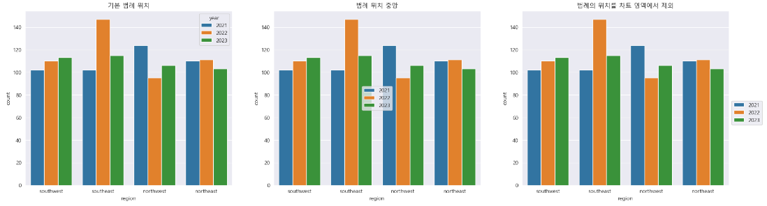
축 제한 범위 조정
데이터 시각화에서 멀리 떨어져 있는 이상값이나 작은 데이터 점을 자세히 검사하려면 x축에 xlim 함수를 사용하고, y축에 ylim 함수를 사용하면 됩니다. 이러한 기능을 사용하면 특정 데이터 범위에 대해 집중적으로 탐색할 수 있습니다.
# 축 제한 범위 지정
plt.figure(figsize = (22,8))

plt.subplot(1,2,1) # Plot 1 with default axes label
sns.histplot(x = insuranceData.charges)

plt.subplot(1,2,2)
sns.histplot(x = insuranceData.charges)
plt.xlim(50000,)
plt.ylim(0,10);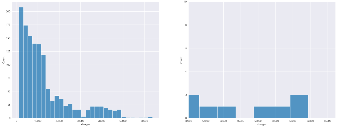
이번 포스팅을 통해 데이터를 시각화하는 디자인 기술을 향상시키는 데 도움이 되었으리라 생각합니다.
특정 변수에 대한 차트를 선택할 때, 올바른 도표 선택 및 데이터 시각화 해석에 대한 포괄적인 가이드를 자세히 살펴보시기 바랍니다.
감사합니다.