이번 포스팅에서는 데이터 시각화 라이브러리 Matplotlib 테마 를 꾸미는 방법에 대해서 알아 보겠습니다. 데이터 과학자라면, 많은 데이터를 보유하고, 분석 하더라도 결과에 대한 최종 판단 및 정리는 시각화를 기반으로 한다는 것을 잘 알고 있습니다. 또한, 시각화 자료는 제 3자에게 유익하고 직관적일 뿐만 아니라 스타일리시해야 합니다.
일반적으로 python matplotlib와 seaborn 스타일을 많이 사용합니다. 많은 사람들에게 다소 지루하게 느껴질 수 있습니다. 시각화 자료를 센스있게 꾸미기 위해 일반 선/산점도, 히스토그램 및 기타 기본 시각화에 색상을 지정할 수 있는 방법에 대해 알아 보고자 합니다.
실습 데이터 생성
우선, 실습을 위한 데이터를 생성하는 것부터 시작하겠습니다.
# 필요 라이브러리 설치
!pip install aquarel catppuccin-matplotlib mplcyberpunk matplotx vapeplot

# 라이브러리 임포트
import matplotlib
import matplotlib.pyplot as plt
import numpy as np
import pandas as pd
import seaborn as sns

from aquarel import load_theme
import mplcatppuccin
import mplcyberpunk
import matplotx
%matplotlib inline

# 산점도를 생성하기 위한 데이터 생성
def scatter():
  x = np.random.random(100)
  y = x-np.random.random(100)
  z = np.random.randint(0,4,100)
  df = pd.DataFrame({'X':x, 'Y': y, 'Z':z})
  return df

# 선 그래프를 생성하기 위한 데이터 생성
def line():
  x = np.arange(0,10,0.1)
  y1 = np.sin(x)
  y2 = np.sin(x+5)
  y3 = np.sin(x+10)
  y4 = np.sin(x+15)
  y5 = np.sin(x+20)
  df = pd.DataFrame({'X':x, 'y1':y1, 'y2':y2, 'y3':y3, 'y4':y4, 'y5':y5})
  return df

# 다양한 확률 분포로부터 데이터 추출하기
def hist():
  x1 = np.random.normal(1,0.1,1000)
  x2 = np.random.gamma(1,0.25,1000)
  x3 = np.random.normal(0.4, 0.1,1000)
  x4 = np.random.normal(-0.1, 0.3,1000)
  df = pd.DataFrame({'X1': x1, 'X2':x2, 'X3': x3, 'X4':x4})
  return df
이제 그래프 테마를 변경하는 방법에 대해서 알아 보겠습니다.
Aquarel
Aquarel 라이브러리는 어두운 스타일과 밝은 스타일을 포함하여 11가지의 다양한 스타일을 제공합니다. 컨텍스트 관리자를 통해 아래와 같은 테마를 사용할 수 있습니다.
with load_theme("arctic_dark"):

  fig, ax = plt.subplots(ncols = 2, nrows = 2, figsize=(16,9))
  df = scatter()
  f= ax[0,0].scatter(df.X, df.Y, c = df.Z, s = 50)
  ax[0,0].set_xlabel('X data')
  ax[0,0].set_ylabel('Y data')
  handles, labels = f.legend_elements(prop = "colors", alpha = 0.6)
  legend2 = ax[0,0].legend(handles, labels, loc = "lower right")

  df = line()
  df.plot(x = 'X', ax = ax[0,1])

  df = hist()
  sns.kdeplot(df, fill = True, ax = ax[1,0])
  ax[1,0].set_xlabel('Value')

  sns.kdeplot(df, x = "X1", y = "X2", fill = True, ax = ax[1,1])
  sns.kdeplot(df, x = "X3", y = "X4", fill = True, ax = ax[1,1])
  ax[1,1].set_xlabel('Dist 1')
  ax[1,1].set_ylabel('Dist 2')

  plt.suptitle('Aquarel\narctic_dark', fontsize=24)
  plt.savefig('arctic_dark.jpg')
  plt.show()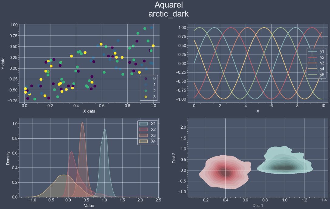
Rosé Pine
Rosé Pine은 라이브러리가 아니라 다운로드한 후 matplotlib의 경로를 지정해서 사용 하는 테마 세트입니다. 해당 테마를 다운로드 하려면, 여기를 클릭하세요. 클릭하신 후, 아래 빨간색 테두리로 표시한 아이콘 버튼을 누르시면, 해당 테마를 다운로드 하실 수 있습니다.

#rose pine moon 테마 적용하기
plt.style.use('D:/rose-pine-moon.mplstyle')

fig, ax = plt.subplots(ncols = 2, nrows = 2, figsize=(16,9))
df = scatter()
f= ax[0,0].scatter(df.X, df.Y, c = df.Z, s = 50)
ax[0,0].set_xlabel('X data')
ax[0,0].set_ylabel('Y data')
handles, labels = f.legend_elements(prop = "colors", alpha = 0.6)
legend2 = ax[0,0].legend(handles, labels, loc = "lower right")

df = line()
df.plot(x = 'X', ax = ax[0,1])

df = hist()
sns.kdeplot(df, fill = True, ax = ax[1,0])
ax[1,0].set_xlabel('Value')

sns.kdeplot(df, x = "X1", y = "X2", fill = True, ax = ax[1,1])
sns.kdeplot(df, x = "X3", y = "X4", fill = True, ax = ax[1,1])
ax[1,1].set_xlabel('Dist 1')
ax[1,1].set_ylabel('Dist 2')

plt.suptitle('Rosé Pine moon', fontsize=24)
plt.savefig('Rosé Pine moon.jpg')
plt.show()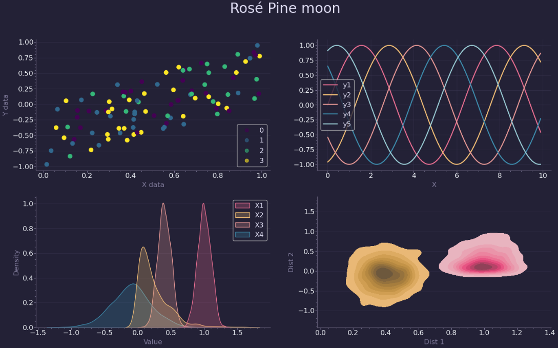
mplcyberpunk
이 라이브러리는 유명합니다. 적절한 색상과 배경을 제공할 뿐만 아니라 플롯에 빛나는 효과를 추가할 수 있기 때문입니다.
# 필요 라이브러리 로드
import mplcyberpunk

# 테마 적용
plt.style.use("cyberpunk")

# 그래프 그리기
fig, ax = plt.subplots(ncols = 2, nrows = 2, figsize=(16,9))
df = scatter()
f= ax[0,0].scatter(df.X, df.Y, c = df.Z, s = 50)
ax[0,0].set_xlabel('X data')
ax[0,0].set_ylabel('Y data')
handles, labels = f.legend_elements(prop = "colors", alpha = 0.6)
legend2 = ax[0,0].legend(handles, labels, loc = "lower right")

df = line()
df.plot(x = 'X', ax = ax[0,1])

df = hist()
sns.kdeplot(df, fill = True, ax = ax[1,0])
ax[1,0].set_xlabel('Value')

sns.kdeplot(df, x = "X1", y = "X2", fill = True, ax = ax[1,1])
sns.kdeplot(df, x = "X3", y = "X4", fill = True, ax = ax[1,1])
ax[1,1].set_xlabel('Dist 1')
ax[1,1].set_ylabel('Dist 2')

plt.suptitle('cyberpunk', fontsize=24)
plt.savefig('cyberpunk.jpg')
plt.show()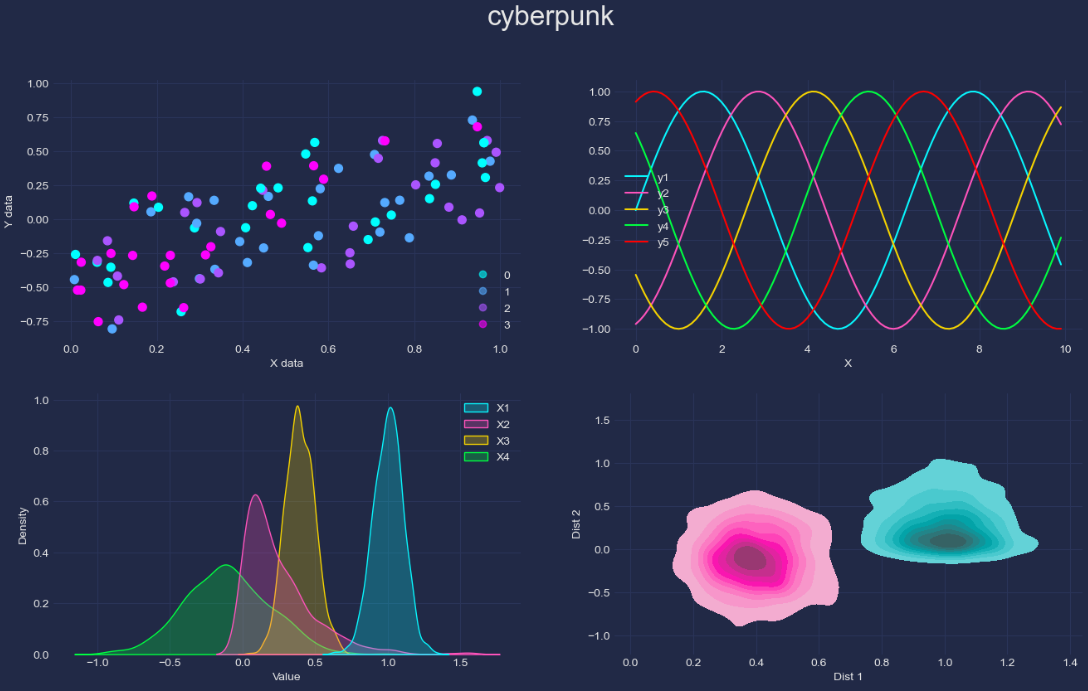
결론
지금까지 데이터 시각화 라이브러리의 테마를 변경 및 적용하여 출력하는 방법에 대해서 알아 보았습니다. 이번 포스팅에서 배운 다양한 테마 설정 방법을 실제 데이터 시각화에 적용해 보시기를 바랍니다.
P.s : 기본적인 데이터 시각화 라이브러리 사용법은 아래 포스팅 글을 참고하시면 됩니다.
https://zzinnam.com/데이터-시각화-기본-디자인-11가지
https://zzinnam.com/matplotlib-데이터-시각화에-대한-종합-가이드part1
감사합니다.